

The fateful trip to Vanness Pens that netted me my vaunted Akkerman ink was not only for Husband and me. Our friend Derek had recently discovered a Waterman Executive fountain pen in the back of a drawer. Silly Derek. He picked up the pen and used it, not realizing he was opening the door to Pen Acquisition Disease. Since there is no cure and Vanness is like a pen addict's Disneyland, we all tucked into the car and took a field trip.
Despite claiming to only like black ink, the exotic allure of Akkerman ink got to Derek too and he purchased a bottle of what we're told is the store's most popular Akkerman color: Shocking Blue.

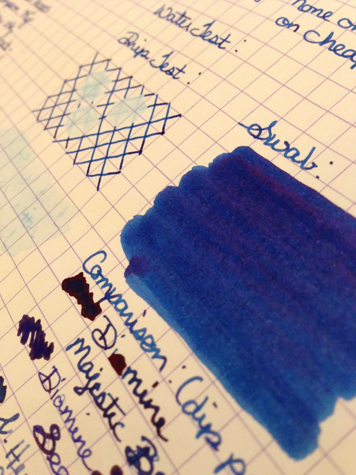
It is an apt name. The closest ink I can liken it to is Diamine Majestic Blue, but there is a slight difference in hue. The Shocking Blue is maybe a half-shade lighter, but it is still a true, center-hued dark blue ink that fills a gap where one might traditionally use a blue-black. The "shocking" part comes in with the intense red sheen the ink can get in saturated areas. Again, this is similar to Diamine Majestic Blue, and it is one of my favorite features.
I wrote the handwritten review with Derek's Waterman Phileas, which wrote nicely but isn't a pen I'm familiar with. While I was at it, I siphoned off a fill for my Pelikan m805 so I could give the ink a test drive in one my most beloved and well-used pens. (Besides, it matches the barrel!)
I found that the things I liked about the ink at first continued to be things I liked about it. The color is just pleasant to look at, either scribbling a grocery list, taking notes for work, or filling up a slew of notebook pages with this and that. I did catch myself getting preoccupied looking at the sheen, losing a thought here or there because I was too busy holding the page up to the light to admire it. (I never said I was an efficient writer, just a passionate one.) The ink feels "soft" on paper, especially Rhodia. It is a feel I've noticed with some other highly saturated inks, leading me to believe it is something about the viscosity of the high dye content that gives that velvety ride. My Denneweg Groen writes smoothly and flawlessly, but it is missing that texture. It's nice...while it writes.
Derek and I both noticed that the Shocking Blue tends to dry out in the nib very quickly when the pen is left uncapped. I'm not talking leaving it uncapped on the dash of your car like your childhood Crayola magic markers, I mean pausing long enough to rephrase a sentence so it doesn't end with a preposition. As a veteran fountain pen user, I've grown used to the compromises and quirks, including getting into the habit of recapping my pen if I'm going to think more than a few seconds. I keep this habit faithfully, but usually found I had recapped the pen too late with the Shocking Blue, though it rarely happens with other inks. My Pelikan m805 is one of the smoothest, most trustworthy, perfect pens I have ever touched and it never skips, at least not of its own accord, but with this ink there was more than once that I had to swipe the nib with a damp paper towel to coax the ink to flow again. I haven't noticed any of this problem when opening the pen for a fresh writing session, so it doesn't appear to be evaporating too rapidly from the pen itself, but I don't plan on leaving it unattended too long. This ink is definitely higher maintenance than Denneweg Groen.
It would be a hard sell of this ink to someone who already owns Diamine Majestic Blue unless the person is as enamored with the amazing bottle as I am. That said, I already own Majestic Blue, and I can already see a space on my ink shelf for a bottle of Shocking Blue. That half-shade of color difference is enough to appeal to me. This ink is the very definition of deep blue, and since blue is my favorite color, there is always room for one more.
As always, my color correction abilities are pretty abysmal. Husband and I are working on remedying that in the future, but hopefully these scans and pictures will give you a pretty close idea of what we are looking at. Er...at what we are looking?


4 comments:
I think you were okay with "looking at" since those two words join to create a single idea. I think that modern grammarist (I made that word up) allow for ending with a preposition when 1.) a single idea/concept is represented (e.g. "running to," "looking at," "getting at"...) and 2.) where other wording would be clumsy or awkward.
I think...
Bill, I believe you are correct, but without ridiculous grammar rules to bat around, where's the fun at? ;)
I love your review (I have a bottle of D's Majestic Blue and you just saved me an expense on Akkerman's) but I love your gorgeous cat even more. :)
Thanks, for both the compliment on the review and on my cat. :) I hope you continue to enjoy your Majestic Blue--it's one of my favorites.
Post a Comment