Showing posts with label vanness pens. Show all posts

Tuesday, July 22, 2014

Tools of the Trade: Ink Review - Diamine Apple Glory

It has been FOREVER since I've posted a Tools of the Trade review, and I have missed them! I love everything about writing, from picking apart pieces of my day in search of nuggets of inspiration and motivation for content and productivity, all the way to poring over the meta-writing experience to examine the act of writing itself, whether it be reviewing inks or obsessively changing the default font on my word processor so it is just right. I so enjoy doing reviews that may help others find more joy in their writing. More joy, more writing, more better.

So there.

I've been going through a dry spell in my own writing life, not so much because of writer's block, but more because of a severe lack of time and energy. These seasons of life come and go, and what is important is to always keep your goals in mind and to try to carve out little slivers of time for things you enjoy. Sometimes for me, that is as simple as finding an ink to write with that is in a better mood than I am. Very often, that ink is Diamine Apple Glory.

As I mentioned in my Noodler's Firefly review, I collect the Lamy Safari limited edition fountain pens, so every year I get a nice, bright new color of pen and I always go searching out an ink to match. In 2012, it was the Apple Green Safari, which I paired with one of the only green inks I had on hand at the time, Private Reserve Sherwood Green (which is a lovely ink, but no real match for the pen at all). I didn't think much about it again until Vanness Pens ran a discount for the 30ml bottles of Diamine inks at the Arkansas Pen show. I pawed through their stash and snagged a bottle of Diamine Apple Glory, thinking it would be a good "sometimes ink."

I paired it up with my Apple Green Safari and settled in to write a few lines in an ink I figured would be too bright for everyday use, but might be fun for art or occasional writing.

I was wrong. The ink was such a perfect match for the pen, with a subtle hint of blue mixed in with the yellow-green, which gives it a sort of "heft" on the page. It is not only legible, it makes words look as if they're floating above the page itself. Very cool.

This is a pretty straightforward ink, and I haven't noticed any particular behavioral concerns. I haven't had any staining, it behaves well on most papers (maybe some slight feathering on cheaper papers, but nothing out of the ordinary), and it flows well. The only real caveat is that it is very susceptible to water, so though it may beckon you to do so, I wouldn't sit and write about the beauty of a gentle summer rain while actually in a gentle summer rain.

I'm sorry for the quality of the scan--it's actually a photo because my scanner doesn't handle these light and bright colors too well. Even though the white balance is off (the paper is actually very bright white), the general character of the color is present. Honestly, it is so much nicer in person, you should really just stop reading this review and go get a bottle of this ink.

Go ahead. I'll wait.

If you're still not convinced, feast your apple-loving eyes on my handwritten review. I guarantee this happy green ink is in a better mood than you are. 


Tuesday, January 14, 2014

Tools of the Trade: Ink Review - P.W. Akkerman Shocking Blue

Last week I gushed about my big, beautiful new bottle of P.W. Akkerman Denneweg Groen. I have continued using it--a lot--and it remains as peaceful and well-behaved as my purring Penny-cat.


The fateful trip to Vanness Pens that netted me my vaunted Akkerman ink was not only for Husband and me. Our friend Derek had recently discovered a Waterman Executive fountain pen in the back of a drawer. Silly Derek. He picked up the pen and used it, not realizing he was opening the door to Pen Acquisition Disease. Since there is no cure and Vanness is like a pen addict's Disneyland, we all tucked into the car and took a field trip.

Despite claiming to only like black ink, the exotic allure of Akkerman ink got to Derek too and he purchased a bottle of what we're told is the store's most popular Akkerman color: Shocking Blue.


It is an apt name. The closest ink I can liken it to is Diamine Majestic Blue, but there is a slight difference in hue. The Shocking Blue is maybe a half-shade lighter, but it is still a true, center-hued dark blue ink that fills a gap where one might traditionally use a blue-black. The "shocking" part comes in with the intense red sheen the ink can get in saturated areas. Again, this is similar to Diamine Majestic Blue, and it is one of my favorite features.

I wrote the handwritten review with Derek's Waterman Phileas, which wrote nicely but isn't a pen I'm familiar with. While I was at it, I siphoned off a fill for my Pelikan m805 so I could give the ink a test drive in one my most beloved and well-used pens. (Besides, it matches the barrel!)

I found that the things I liked about the ink at first continued to be things I liked about it. The color is just pleasant to look at, either scribbling a grocery list, taking notes for work, or filling up a slew of notebook pages with this and that. I did catch myself getting preoccupied looking at the sheen, losing a thought here or there because I was too busy holding the page up to the light to admire it. (I never said I was an efficient writer, just a passionate one.) The ink feels "soft" on paper, especially Rhodia. It is a feel I've noticed with some other highly saturated inks, leading me to believe it is something about the viscosity of the high dye content that gives that velvety ride. My Denneweg Groen writes smoothly and flawlessly, but it is missing that texture. It's nice...while it writes.

Derek and I both noticed that the Shocking Blue tends to dry out in the nib very quickly when the pen is left uncapped. I'm not talking leaving it uncapped on the dash of your car like your childhood Crayola magic markers, I mean pausing long enough to rephrase a sentence so it doesn't end with a preposition. As a veteran fountain pen user, I've grown used to the compromises and quirks, including getting into the habit of recapping my pen if I'm going to think more than a few seconds. I keep this habit faithfully, but usually found I had recapped the pen too late with the Shocking Blue, though it rarely happens with other inks. My Pelikan m805 is one of the smoothest, most trustworthy, perfect pens I have ever touched and it never skips, at least not of its own accord, but with this ink there was more than once that I had to swipe the nib with a damp paper towel to coax the ink to flow again. I haven't noticed any of this problem when opening the pen for a fresh writing session, so it doesn't appear to be evaporating too rapidly from the pen itself, but I don't plan on leaving it unattended too long. This ink is definitely higher maintenance than Denneweg Groen.

It would be a hard sell of this ink to someone who already owns Diamine Majestic Blue unless the person is as enamored with the amazing bottle as I am. That said, I already own Majestic Blue, and I can already see a space on my ink shelf for a bottle of Shocking Blue. That half-shade of color difference is enough to appeal to me. This ink is the very definition of deep blue, and since blue is my favorite color, there is always room for one more.

As always, my color correction abilities are pretty abysmal. Husband and I are working on remedying that in the future, but hopefully these scans and pictures will give you a pretty close idea of what we are looking at. Er...at what we are looking?


Tuesday, January 7, 2014

Tools of the Trade: Ink Review - P.W. Akkerman Denneweg Groen

Have you ever noticed how seeing something you can't have makes you want it even more?

Yeah, me too. My list is long, including vintage Mustangs, signed first editions of To Kill a Mockingbird, 90's Nickelodeon, a bed (don't ever give away your old bed before your new bed is delivered because it probably won't be delivered--ask me how I know), a vacation, and Akkerman ink.

I first heard about Akkerman ink from the inimitable fountain pen reviewer and contributor to FPGeeks, Stephen Brown. Being a resident of the Netherlands, he first showed the rest of world the un-have-able Akkerman ink.


Photo courtesy of Marieke G. via yelp.com
I wanted it. Lots of people wanted it, but the only place a person could get it was from P.W. Akkerman's located in the Hague, Netherlands. For a time, there was no way to order it unless you were fluent in Dutch and were prepared to buy a plane ticket to pick it up.

The ink itself looked good to me, but the real draw was the BOTTLE. Even if I was not an avid pen user and ink enthusiast, I would want the bottle. It is just cool. If there was such a thing as a genie and it had a literary streak, it would live in this ink bottle. If I was that genie, I certainly would.

I grumbled about my misfortune, this cool bottle of ink that I wanted as much a vintage Mustang and a new episode of Are You Afraid of the Dark? that I was likely never to have.

But then! My favorite pen store came to the rescue.


Vanness Pens in Little Rock, Arkansas is the only distributor of Akkerman ink in the U.S. that I know of, and they carry all the colors of the rainbow. It is a beautiful, genie-filled rainbow.

After my last trip to Vanness, I left with a bottle of Akkerman Denneweg Groen (translated as Denneweg Green. Denneweg is a street in The Hague, but why oh why is it associated with green?) I may have also slunk out with a pen and some paper, but that is beside the point. I only bought those things because the staff at Vanness is so nice. ONLY. I'm cool that way.

I chose this color because I have long been after a bottle of Iroshizuku Shin-ryoku (Forest Green). It is a lovely dark blue-tinged green with a lot of nuance and texture. Akkerman Denneweg Green is a DEAD RINGER for the Iroshizuku Shin-ryoku, and when you calculate the price to volume ratio, it is a lot cheaper. Plus, the awesome bottle! Plus-plus the fact that this is the vaunted grail ink I thought I'd never have.

Yes, please.

It's a huge bottle of ink. 150mL is roughly enough ink to write by hand the great American (Dutch?) novel, the second greatest American novel, and the second greatest French novel (because Les Miserables can never be topped), and you would still have enough left over to write letters to all the TV executives that cancelled your favorite shows. It is a LOT of ink.

The inkwell in the neck of the bottle is worth the price of admission. It makes it so easy to fill your pen without getting inky, and when the ink level gets low (and by then, expect you'll be in a nursing home explaining to the staff what a pen is and why you insist on scratching symbols on wood-pulp instead of communicating telepathically like everyone else), you will still have enough volume to submerge the nib. The bottle shape also keeps things stable, and with that much ink volume, stable is a good thing.


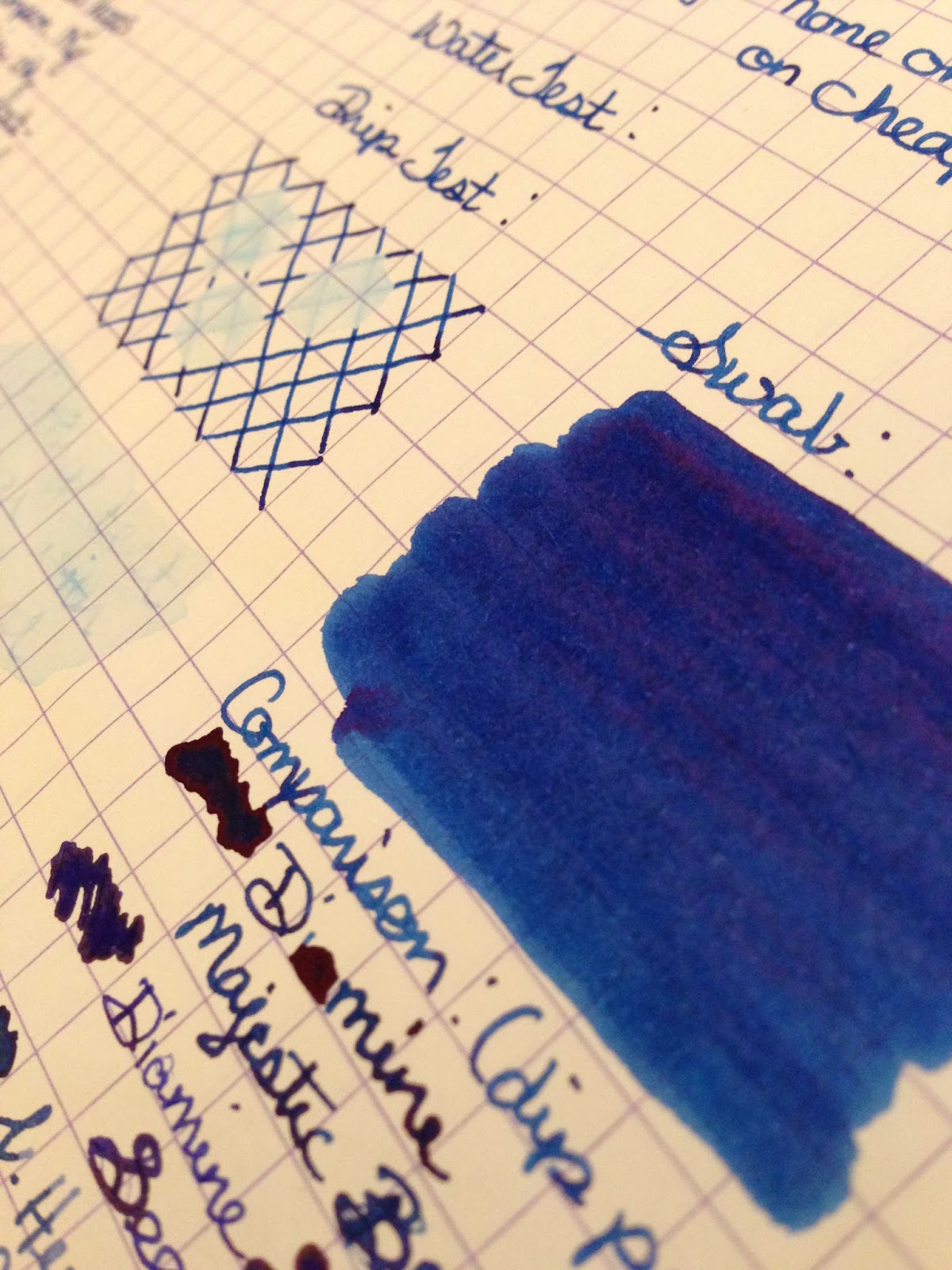
Since I wrote the handwritten review, I've had more time to play with the ink, and I can say that it is truly well-behaved. I haven't had any problems with it clogging or staining, and the flow has been satisfactory in the pens I've used it in. I've tried it on a variety of papers, ranging from Rhodia to a cheap composition notebook, and while there was some mild feathering and bleedthrough on the cheaper paper, it was comparable to other well-known, well-behaved inks. I tend to write with finer nibs, so your mileage may vary if you prefer broader ones, but thus far, I'd say this ink uses its manners.

If you want your very own bottle of Akkerman, you needn't gnash your teeth or cash in your frequent flier miles, you just need to pick up the phone and call Vanness Pens. I believe there may be some restrictions with advertising the ink on their website, but I assure you, they have the ink in stock and if you pay them a fair and reasonable amount of money, they will send you some. If you find yourself in Little Rock, pick some up in person, but be warned--you'll probably also leave with a pen. Or two.

My scan doesn't really capture the true color of the ink. I tried to get some pictures of the subtle depth and sheen of the ink, but didn't really manage it. I guess you'll just have to try some for yourself.

Now you have no excuse not to.


Tuesday, January 29, 2013

Tools of the Trade: Ink Review, Pilot Iroshizuku Kon-peki

As a bribe for going to the dentist, my husband got me a bottle of one of my most vaunted inks. It's pricey stuff, and due to the cost of said dentist, not many pricey things will be coming my way for a while. However, I count myself lucky to have gotten my grubby little hands on a bottle of this ink to keep me writing even though my creative energies fell off the truck somewhere back there right around mile "I-broke-my-freakin'-teeth-and-can't-eat-food."

Here I present to you, Pilot Iroshizuku Kon-peki, Superink! It is pictured with my beloved Pilot Vanishing Point in Blue Carbonesque, but the review was written with a Sailor 1911s.

First of all, the bottle is just about worth the price of the ink. If I had the funds, I'd decorate my office with them. When the light shines through the thick glass just right, it's a really, really pretty sight. You can't see it in this pic, but there is a little divot in the thick part of the glass at the bottom of the bottle that is perfect for fitting in the nib to fill your pen when the ink level gets low. The way I'm nursing this ink, that'll be a while. 


I apologize that the scan of this review is not color corrected. There is really something missing from it that makes the ink much more special in person. There are several retailers online, such as Goulet Pens, who have color corrected swabs that might give you a better idea of the true color. It's also worth noting that we purchased this ink through Vanness Pens in Little Rock, AR who have the fastest shipping and best prices ever.

 I hope this review was helpful to those who love fun inks and pens as I do, and to those who don't, I hope you see what you're missing with that ballpoint you snagged from the bank. Yeah, you know the one. It's green with a white clicky thing and it always skips when you're trying to sign your name. You don't even use that bank. Where did that pen come from, anyway?

I wouldn't trust it. No sirree.