A while back,
I promised in-depth reviews of the new Diamine 150th Anniversary ink set. I meant to get to it before now, but since I don't have a time machine (or do I?), I decided I would just cut to the chase and post all the reviews in one fell swoop.
Overall, though each of these inks has its own personality, I can say that they are universally well-behaved and pleasant to use. I spent about a week writing with them sporadically, and never had any issues with hard-starting or clogging. I think it's fair to judge these inks by their color and not worry too much about letting it touch your beloved pens (as long as you're good with your pen hygiene! You can't blame the ink if you let it sit for months and it ruins your pen). It is my understanding they will be available on a continual basis, so don't be afraid to fall in love.
1864 Blue Black

Blue black is one of those colors everyone needs, so all the pen/ink manufacturers have some variation. Several of the ones I've tried have ended up being a kind of chalky, sometimes almost greenish dark blue, but not what I would call truly blue-black. Not so here. This is as true a blue-black as ever there could be. It's dark, very, but the blue shows up in the light. When I go hunting for a stolid, almost intimidating blue-black, I think this will be the one I reach for. My only issue with it is that it is not even remotely water resistant, so that is something to consider if signing documents.
 |
| Click to Read |
|
Blue Velvet
I am a long established blue ink junkie. I have more bottles of blue ink than any other color, and I know them all by heart. There are three blues in this set, but Blue Velvet was the one that stole my vision. It's just gorgeous, and though nothing (
nothing) captures the vibrancy of Noodler's Baystate Blue, this is a good substitute if you're after a soul-stirring true blue ink.
 |
| Click to Read |
|
Carnival
This is the one ink in the set that I was most concerned about with regard to behavioral problems. It's red. I love a good deep red ink, which this one is, but red dyes are notorious for staining. I'm pleased to say this ink did not end up leaving its mark on my pen, but I did make sure not to leave it in the converter for a long period time. That's just good practice anyway, but especially with red inks. That said, I love this color! It's a rich, true red without leaning too much to the orange side. I am really going to enjoy this one, and it will likely replace Diamine Poppy Red as my editing ink.
 |
| Click to Read |
|
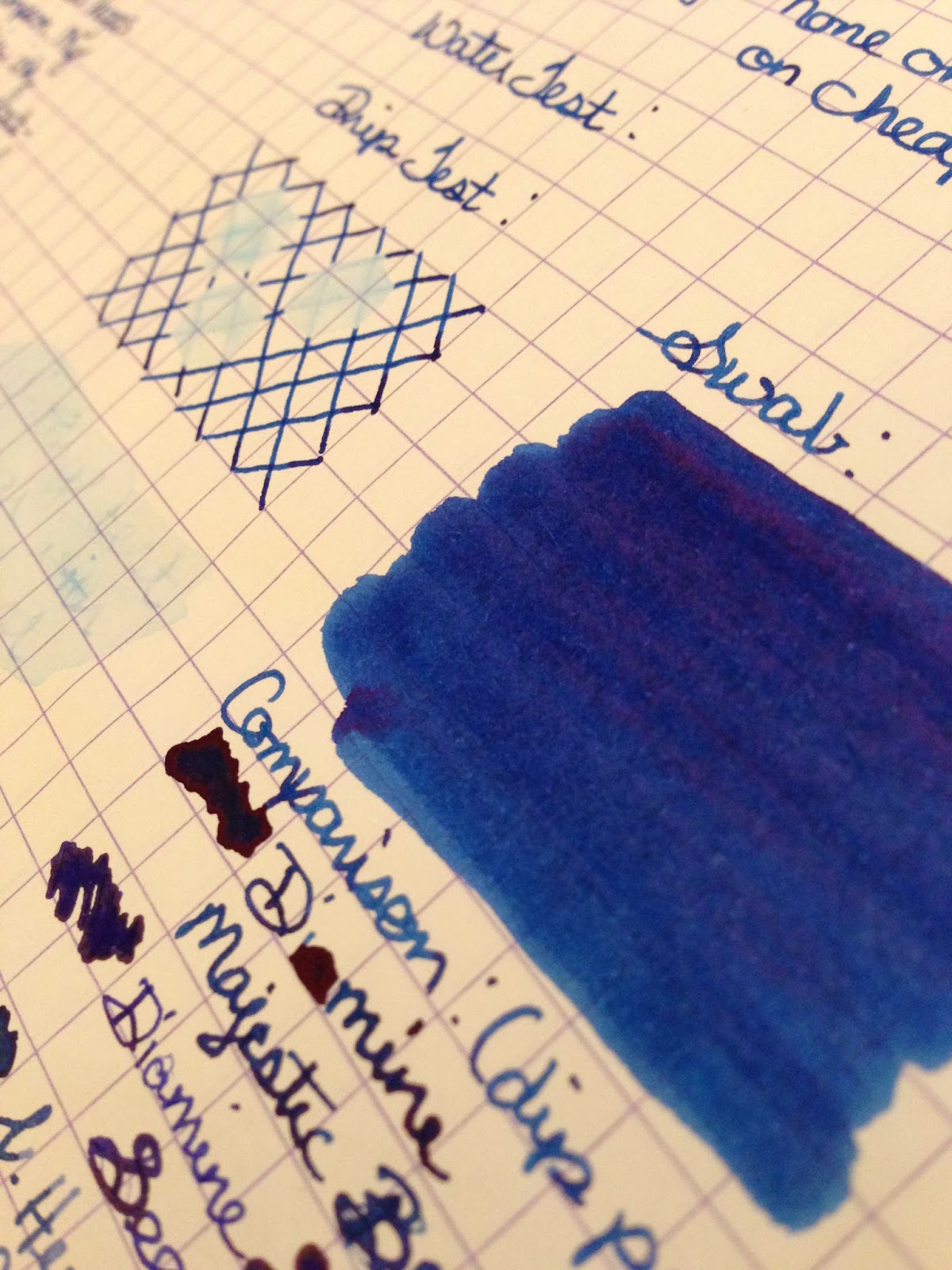
Regency Blue
Regency Blue covers the place between the rich, true-blue of Blue Velvet and the near-vacuous 1864 Blue Black. It is a dark blue, but a true one, and would be the kind of ink that could fill almost any need handily. It is a highly saturated ink, much like
Diamine Majestic Blue or
P.W. Akkerman Shocking Blue, but it is missing some of the sheening qualities those display. I suspect that may be why I had such a different experience with clogging here. Both Majestic Blue and Shocking Blue are deep and fascinating with the red sheen puddling up from heavy areas, but they also clog like crazy in a very short time. I did not have that problem with Regency Blue. Do I miss the sheen? I do, a little, but that's not the only reason I reach for a rich blue, and it's good to know there is a better-behaved version in my collection.
 |
| Click to Read |
Safari
I don't think there are many other inks out there that fit this unique niche. I don't know what it is about this shade that intrigues me, but for some reason it catches my eye. I love olives, but if you ever asked me where olive green rates on my list of favorite colors, it would be pretty far down the list. I mean, it's like
The Brady Bunch's carpet, right? However, there is something about the context of this color as an ink that works for me. I have to lump this one and Terracotta together as my "sleeper" inks, ones I wasn't sure I would like that I ended up enjoying a lot. The closest other color to this that I've used is Rohrer & Klingner Alt-Goldgrün, which I sampled as a potential match to my Pelikan White Tortoise m400. This ink is almost a dead ringer, maybe missing just a little yellow pop. I think it's going to get a surprising amount of use.
 |
| Click to Read |
|
Silver Fox
Silver Fox stands out as the mildest ink in the set, a mellow gray whispering to be seen among the likes of stunners like Blue Velvet and bullies like 1864 Blue Black. When it gets its chance to shine, though, it's such a lovely color. I really like the look of a full page written in a friendly gray. It reminds me of my pencil days without the threat of erasure. Unless there is water, of course. This stuff ceases to exist when wet, but what do we expect from such a polite ink?
 |
| Click to Read |
|
Terracotta
If Safari is
The Brady Bunch's carpet, Terracotta seemed to me that it would go nicely with their kitchen counters. There is just not much about a flower pot I would have ever told you would be attractive, but here again, I ran it through a pen and found myself amazed at how much I enjoyed watching it fill up the page. There is a lot to enjoy here--the ink shades like a champ, and it has a cool color change effect as it dries. I always enjoy that, as it makes the meta-writing experience a little more interesting. No one is more surprised than me, but this may be my favorite ink of the whole set. (Shh. Don't tell Blue Velvet.)
 |
| Click to Read |
Tropical Green
Tropical Green is probably the green equivalent to Blue Velvet for vibrancy. Diamine has a lot of greens to choose from in their line, but Tropical Green hits that middle-green area with fervor. It leans a little toward the blue, but it knows who it is. It is Tropical Green, mighty, strong-willed, and pretty good at shading. I don't have a ton of green inks in my collection, and if you're only going to have one, this is a good candidate.
 |
| Click to Read |
|
This concludes your 8-for-1 ink review special! If any or all of these inks strikes your fancy, you can snap them up one at a time or as a set. Again, I'm grateful to my friend Derek for giving this set to Husband and me for Christmas, and grateful to
Vanness Pens for answering the phone when he called to snap it up about as quickly as they had unboxed it. It's rare that I get to be a front-of-the-line person, and it was pretty cool being among the first to try these out. It's also cool getting presents you really love from friends who share your interests. They're worth their weight in gold (nibs or otherwise).